Role:
Ux Designer
App design for local pet grooming company, allowing clients to book appointments online and purchase pet care products.
Type:
App Feature Design
Tools:
“The Burrow” Moleskine Creative Community
Interview, Affinity Mapping, User Flows. Sketching, Wireframing, Prototyping
The Brief:
As a team of four UX designers, we were given the brief:
"Moleskine wants to explore the possibility of adding a killer new feature to their smart notebook line — social networking. Honouring the brand's heritage of literary and visual creativity, how could a custom social networking experience enhance the needs of Moleskine owners who might want to share — publicly or anonymously — their work? What aspects of the ways Moleskine is used today — journaling, sketching, creative note-taking — could be made even better or more fulfilling?"
In short: our task was to design a social networking platform built specifically for Moleskine's creative community.
Key Considerations
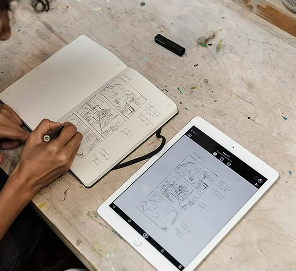
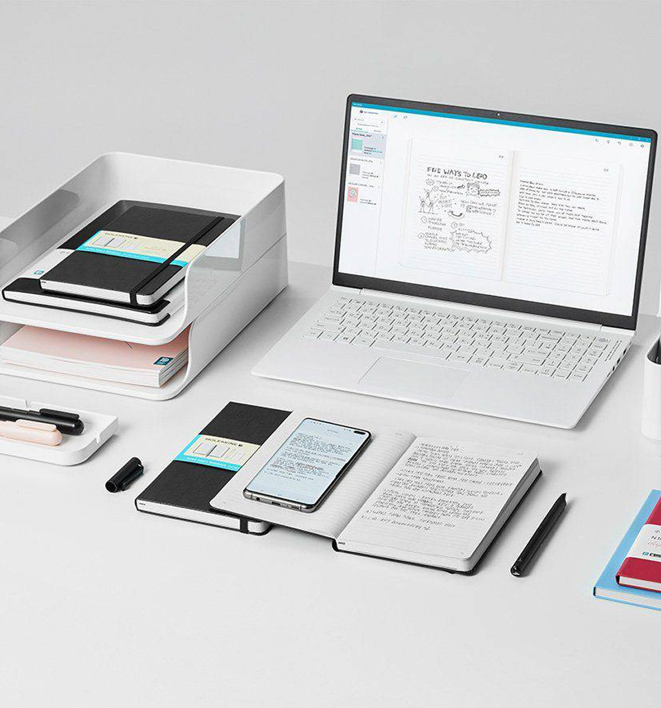
As a team, we began by researching the Moleskine brand, its product offering, and the Moleskine Notes App — the ecosystem the new social feature would need to sit within.
A small Milanese publisher revived the legendary notebook brand in 1997
Previously beloved by Hemingway, Picasso, and Van Gogh
Marketed as sleek and modern, with a nostalgic feel
Built a cult following among writers and designers
Walks the tightrope between authenticity and scale
The Moleskine Brand:
Notebooks and journals
Smart Writing Pen and Notes App
Analogue Pens and Writings Tools
Planners
Bags
Cases and Covers
Stationary and Accessories
Gift Sets and limited edition runs
Moleskine Products:
Real-time digitisation
Audio Recordings
AI handwriting-to-text transcription
Rich export options
Sync with Google Drive, OneDrive and Evernote
Pair with Smart Pen and Smart Notebook
Moleskine Notes App:
The Research:
Moving into the research phase, we used user interviews and competitor research to understand what users needed to feel safe entering a creative community, alongside what the competitive landscape looked like. Working with another team member, I led the user interviews and completed the affinity mapping.
Research Method 1: User Interviews
We interviewed six notebook users, with the interview questions based around:
How they use their notebooks
Their feelings around current social media platforms
How they feel about sharing work and receiving feedback
What makes them feel safe in a digital community environment
Research Method 2: Competitor research
Two team members analysed six community platforms and three digital notebook competitors.
The findings were clear: there are no social platforms built for analogue-first creators.
Key insights from affinity mapping the interviews included quotes such as:
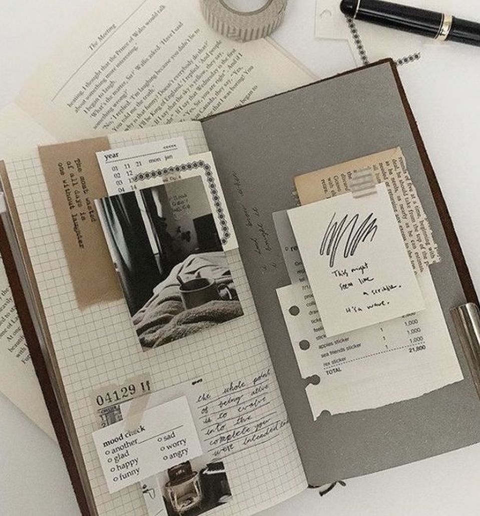
“Hand-made work feels more human, authentic, and meaningful than polished digital content”
“I use digital tools to refine and share my work, but my creative thinking starts on paper”
“I hesitate to share early ideas because they feel personal, unfinished, and easy to misinterpret”
“I associate Moleskine with quality, design heritage, and creative identity”
The Persona:
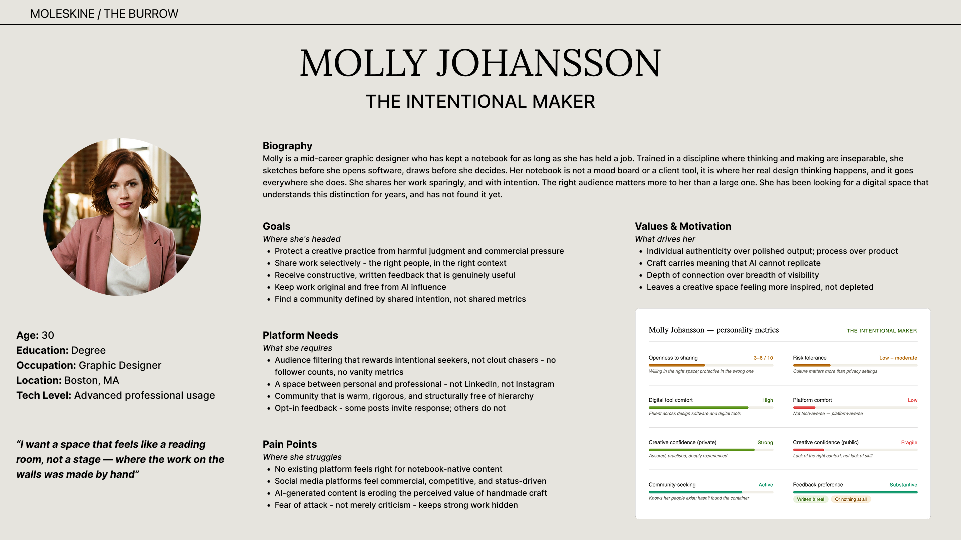
Bringing the research together, we created the primary persona: “Molly Johansson, The Intentional Maker”.
Molly is 30, a Graphic Designer, located in Boston
Starts creative work on paper, moves to digital to refine and share
Doesn't find typical social media feedback helpful
Hesitates to share early work because it feels personal and unfinished
In her words: "I want a space that feels like a reading room, not a stage."
Associates Moleskine with quality, design heritage, and creative identity
From our research, we defined our core problem statement and "How Might We" statements.
The Problem:
Creatives want to connect and be inspired by others in order to grow, but they don’t have a safe space for constructive feedback on current social media platforms.
This leads to isolation, creative stagnation, and loss of confidence.
How Might We Statements:
How Might We design a platform where the culture itself creates psychological safety?
How Might We build a community that centres contribution over consumption?
How Might We leverage Moleskine’s existing trust in craft and intentionality?

Ideation:
User Flow:
Based on Molly, our primary persona, and her need for a safe and supportive space to share work in progress, we identified four key tasks that she would complete on The Burrow:
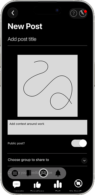
Creating a post
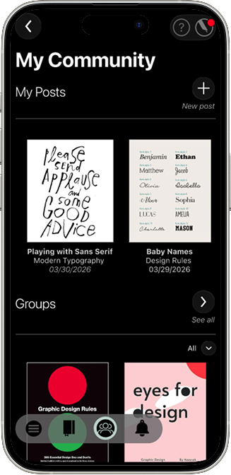
Discovering new groups
Engaging with content
Adding to existing work based on feedback.
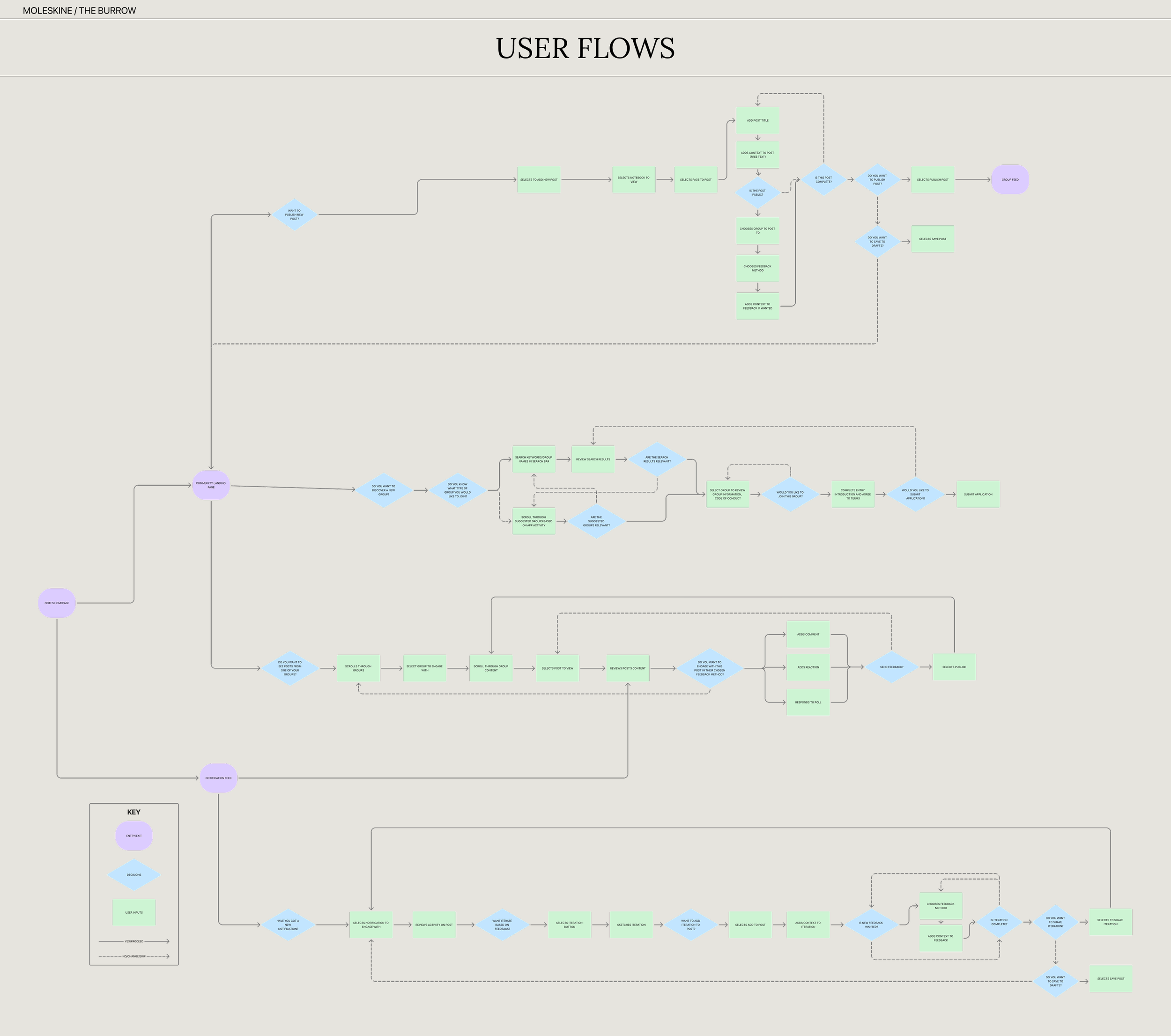
While these are distinct actions, one of our key design decisions was ensuring they felt interconnected, in a creative community, we found these actions rarely happen in isolation.
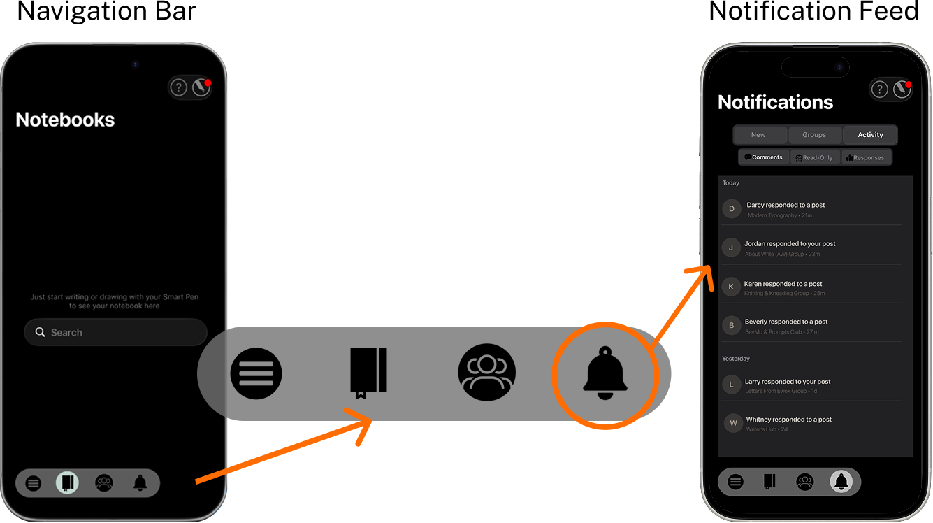
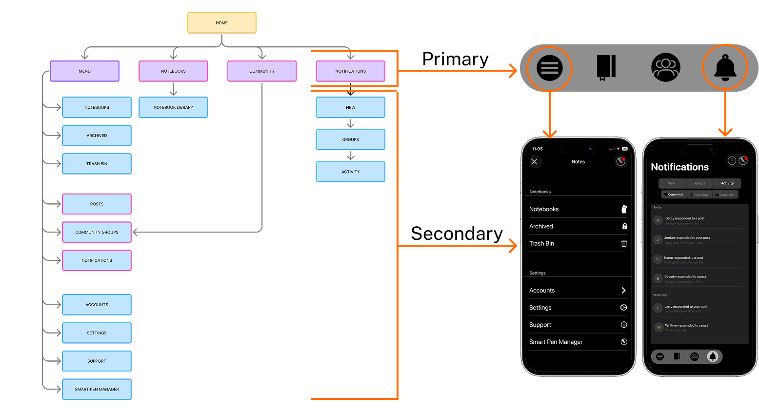
To support this, we introduced a navigation bar that follows the user across every screen, allowing seamless movement between tasks.
We also incorporated a notification system that alerts users to relevant activity, such as feedback on posts or updates within groups, so they can easily engage with everything happening on The Burrow.
Navigation Structure:
As reflected in our sitemap, this led us to a clear hierarchy:
The navigation bar handles frequent primary actions
The hamburger menu and notification feed holds secondary options
Together, this keeps the experience simple and intuitive
The Design:
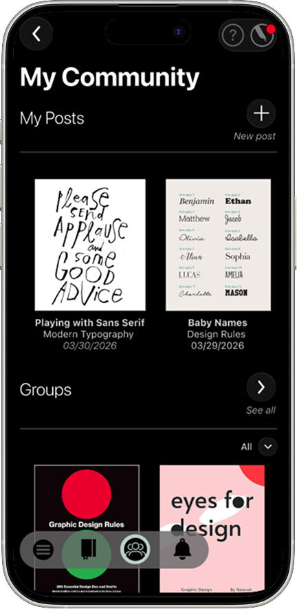
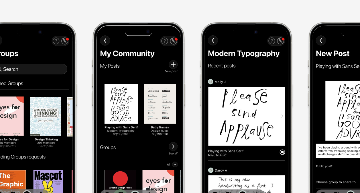
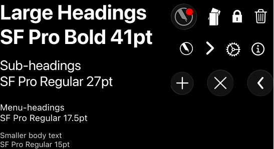
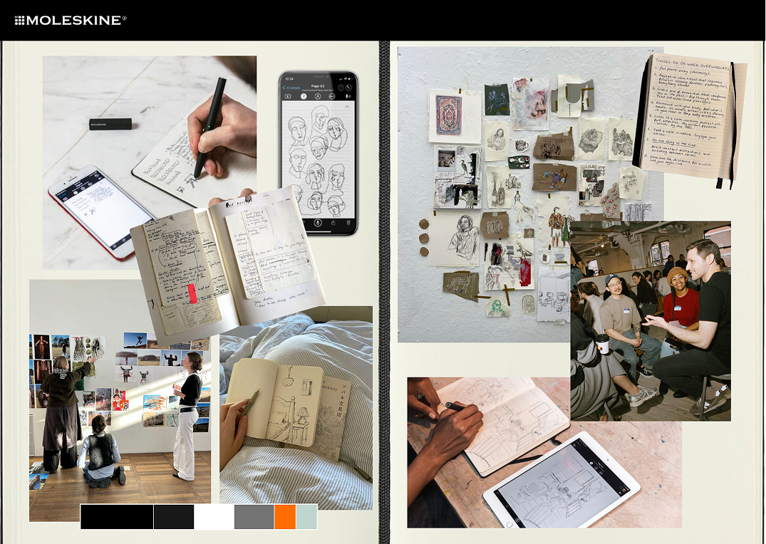
Moving into the visual design for The Burrow, we made a conscious decision to align closely with the existing Moleskine Notes app.
By maintaining consistent colours, typography, and spacing, the new feature feels like a natural extension of the product rather than a bolt-on addition.
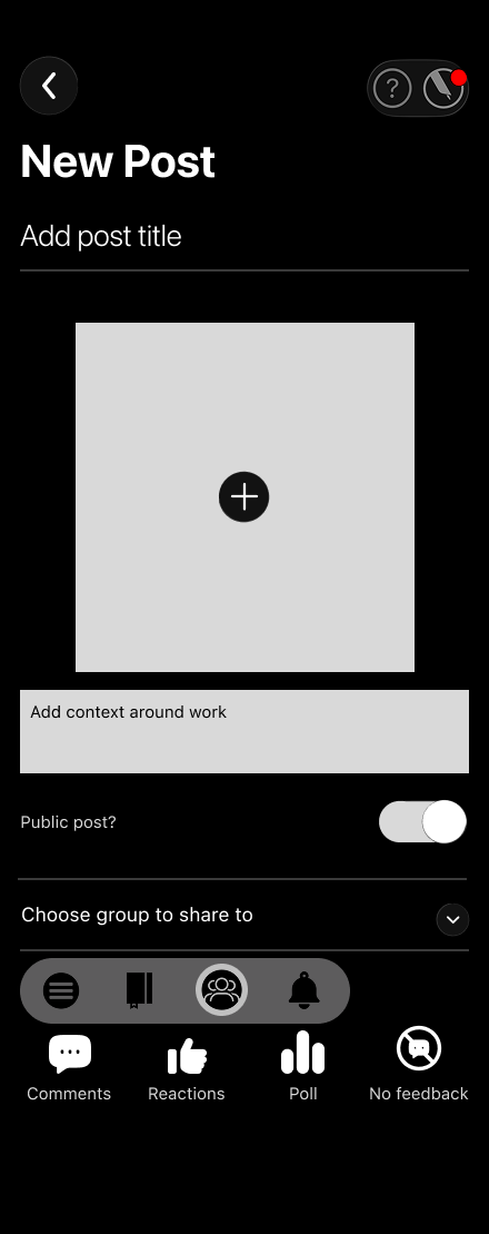
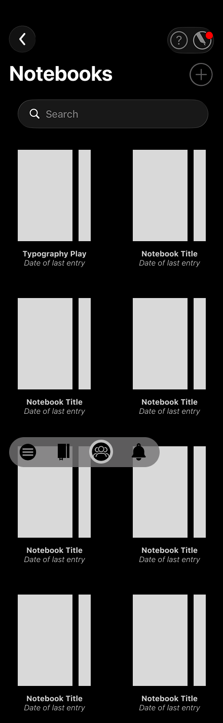
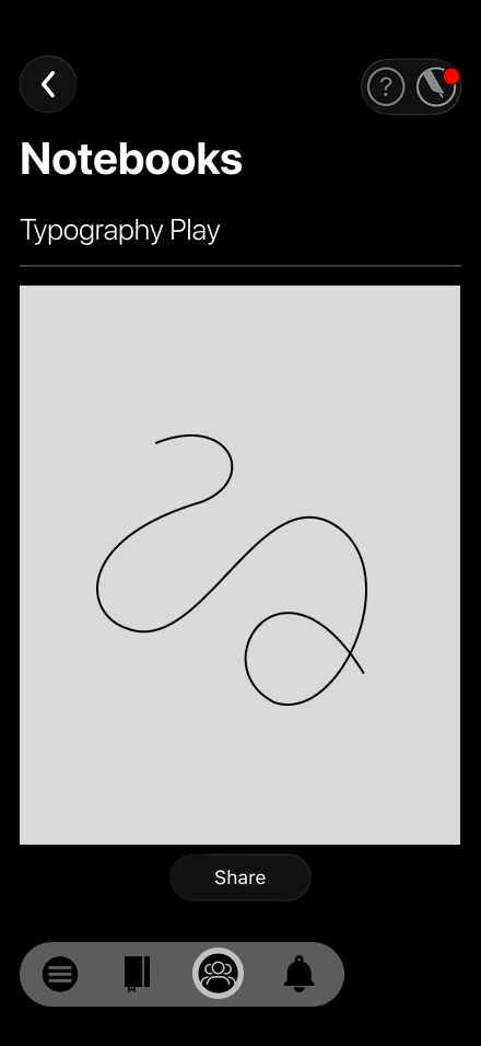
Mapping this out in a clear design guide helped us when it came to wireframing, and allowed us to create a consistent template across all pages.
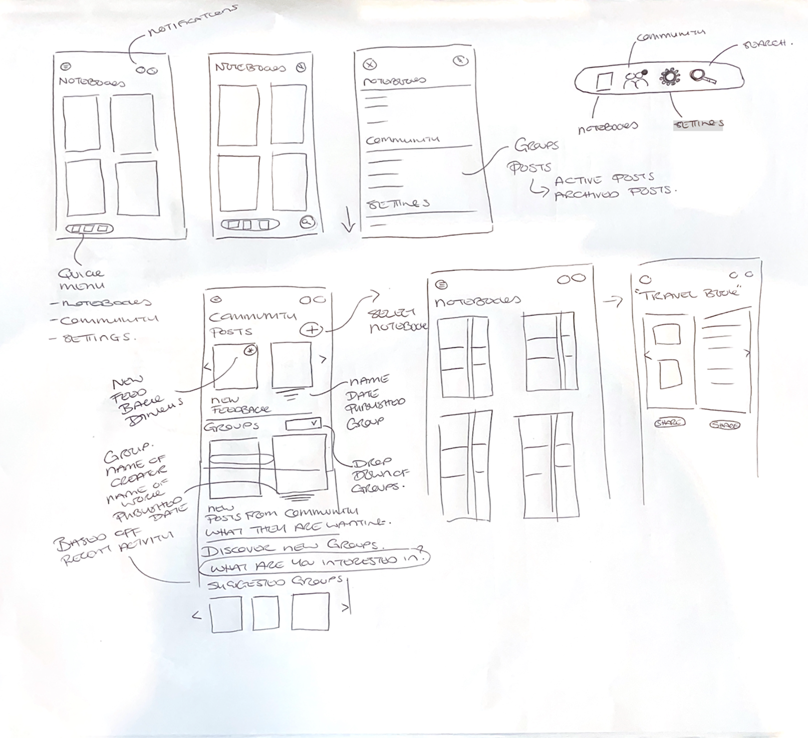
For sketching and wireframing, our team used the design studio method, setting a clear goal for each key page, sketching individual concepts independently, then coming together to critique and iterate as a group.
This approach proved highly effective, allowing us to converge multiple perspectives into a single, cohesive layout that reflected both our research findings and each team member's creative thinking.
We were then able to divide the user flows across the team, while regularly sharing and refining to maintain consistency and ensure alignment with our problem statement and user needs.
Sketches:
Wireframes:
Usability Testing:
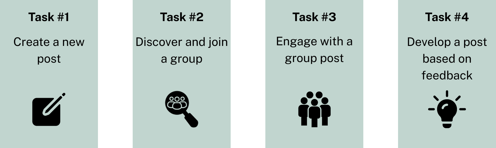
Once our low-fidelity prototype felt cohesive, we moved into usability testing with three participants. Each completed tasks aligned with our key user flows:
Overall, all participants completed these tasks successfully with minimal friction, validating our core structure and navigation.
As expected with any first prototype, testing surfaced valuable issues to address.
Major issues:
Page titles
Clarity of actions
Interaction expectations
Minor issues:
Button labelling and icon choices
We resolved the major issues by:
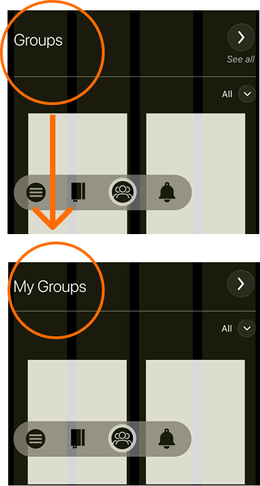
Updating the groups page title from "My Groups" to "Groups," making it clear the page also supported discovering new groups
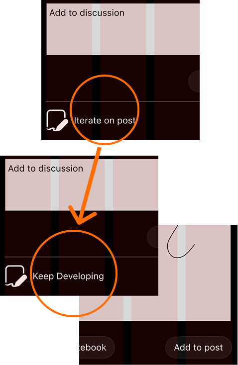
Refining terminology within the posting flow, so it was clear users were adding to an existing post rather than overwriting it
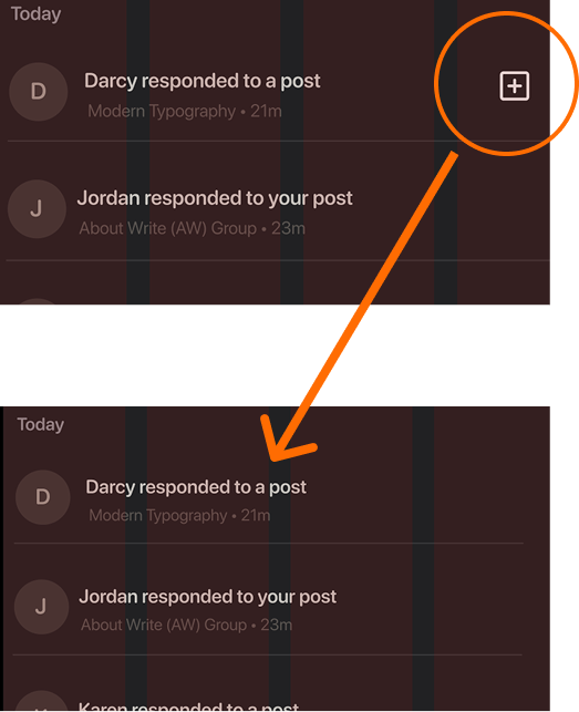
Making notification post text clickable, rather than a secondary icon, to align with familiar patterns
The Prototype:
The Wrap Up:
This project challenged us to imagine social networking without its usual pitfalls, comparison, performance, and noise, and to design something that felt more like a reading room than a stage.
Every decision came back to Molly's core need: a space where sharing early, unfinished, personal work felt safe rather than exposing. The culture-first approach, psychological safety built into the platform itself, not bolted on as a feature, shaped everything from our navigation to our feedback system to the language we used throughout The Burrow.
Working as a team of four brought this concept to life in a way none of us could have built alone, from research and affinity mapping through to the interaction design and feedback system that made The Burrow feel genuinely different from the platforms Molly had grown tired of.
Moleskine may never build this exact platform, but The Burrow shows what's possible when a brand's existing trust, in craft, intentionality, and authenticity, is extended thoughtfully into a digital community, rather than treated as an afterthought.