Role:
UX Designer (Solo)
Client Project (Academic) - General Assembly UX Design Course
Website design for new Osteopathy clinic on the Central Coast. Designed to show practice’s expertise and build patient’s trust.
Type:
Tools:
Moonah Health & Movement Website Design
Figma (prototyping & wireframing), FigJam (affinity mapping), Zoom (interview recordings), Google Docs (SOW & project tracking)
The Brief:
The brief was to design a website for Moonah Health and Movement, a new osteopathy clinic on the Central Coast. The website needed to help patients learn about the practice, get to know lead practitioner Noah, and book an appointment with minimal friction.
What made this project exciting was that Moonah was in the very early stages of being created, there were no existing brand assets or identity to work from. That gave me the opportunity to help set the tone of the business and bring Noah's vision to life from the ground up.
Key Considerations, Constraints & Assumptions
The process started with a client kick-off call, where Noah shared a clear picture of his vision and expectations for the website.
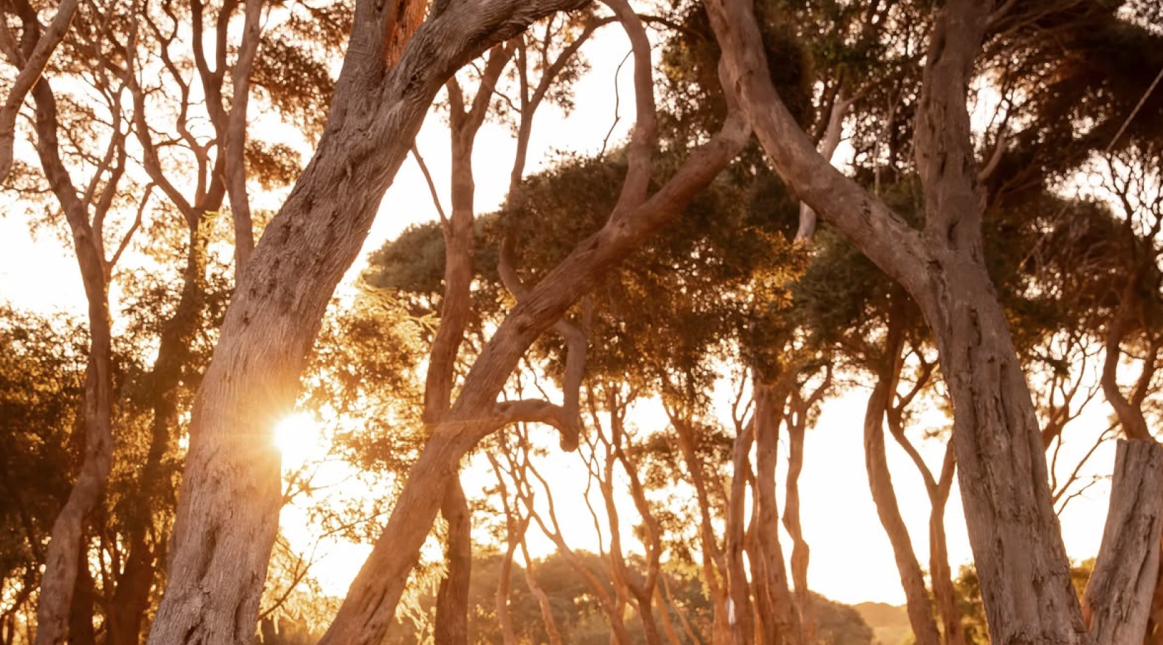
Website to have an Organic Calm feel to reflect the Moonah Tree
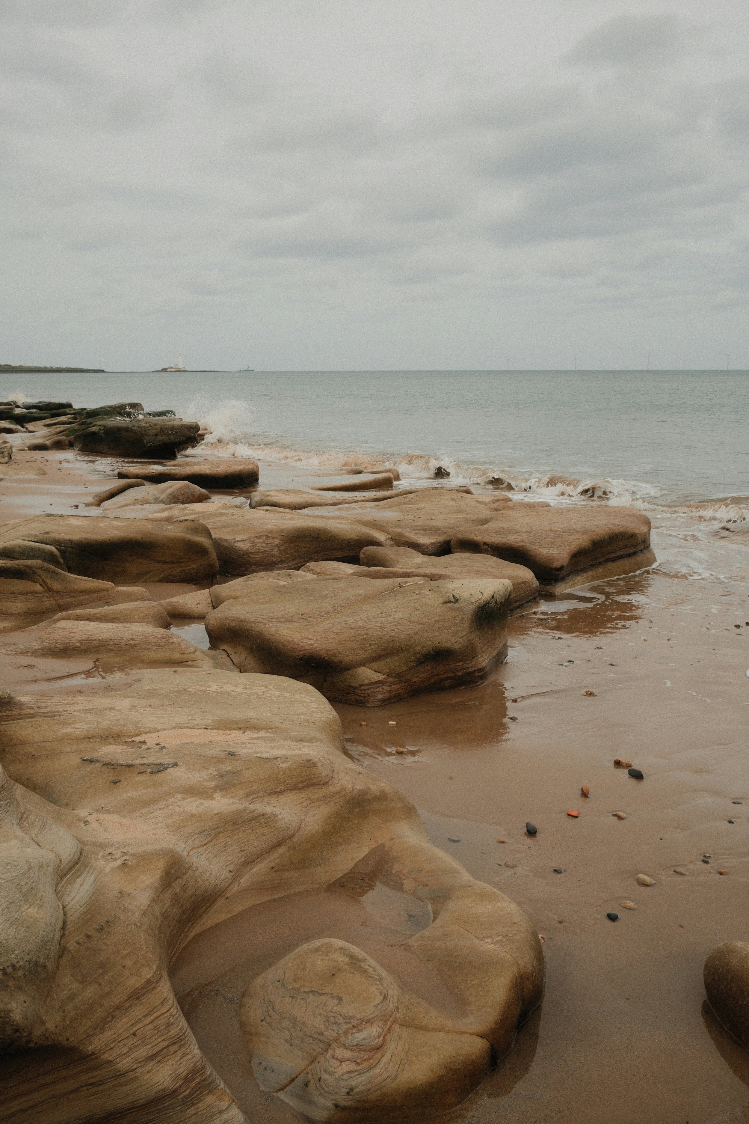
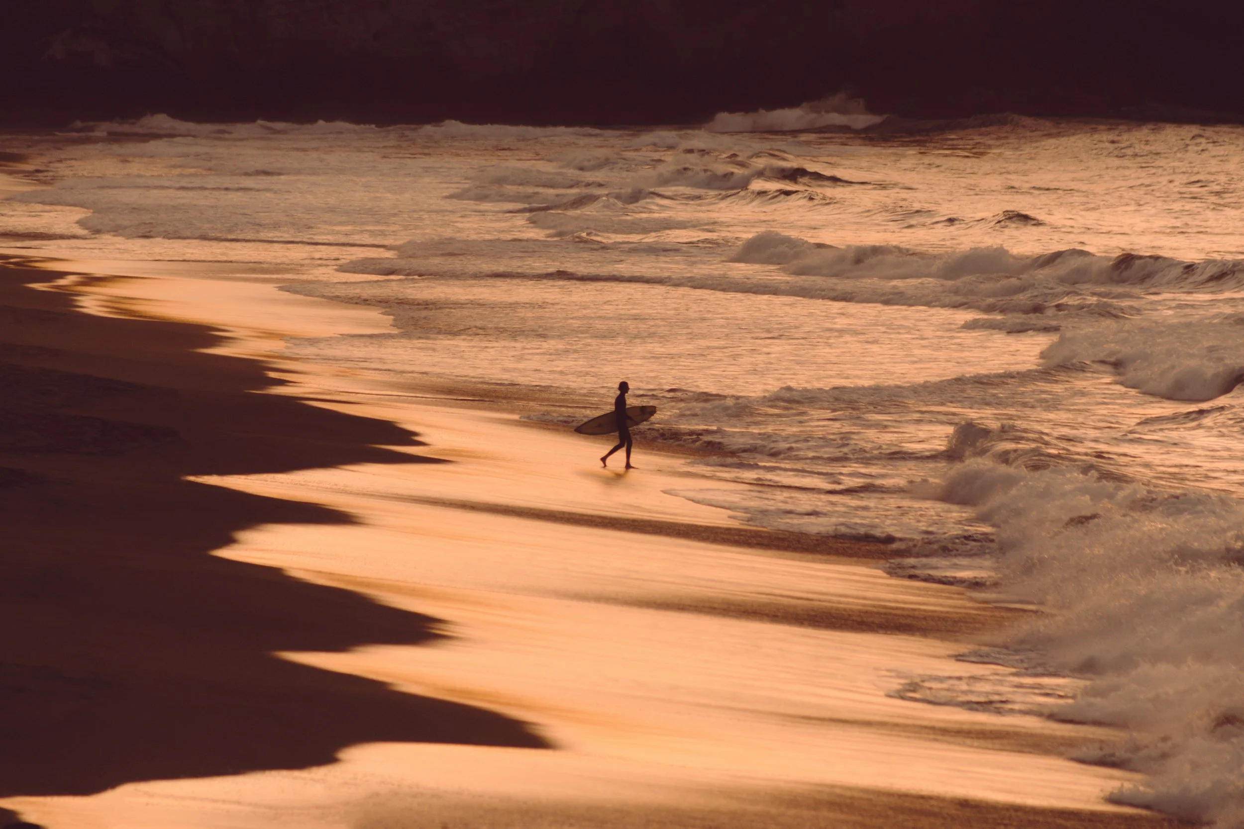
To be Earthy, Coastal, Subtle
To stay away from “Sporty” aesthetic
Adopt a “Less is More” approach
Ensure easy navigation
Key Considerations:
Placeholder imagery and copy to be used for the prototype - final licensed imagery to be sourced by client
The client would provide information on the target audience and direct and aspirational competitors
Key Assumptions:
The booking pathway must lead to the third-party booking system, Cliniko
The site must clearly communicate that the clinic operates on a call-back system
The website must be AHPRA compliant
Key Constraints:
The Research:
Moving into the research phase, I used user interviews and competitor research to understand user needs and identify how Moonah Health and Movement could set itself apart.
Research Method 1: User Interviews
I interviewed four participants aged 25 to 60 who had booked an allied health appointment in the past two years.
Research Method 2: Competitor research
Alongside the interviews, I analysed three direct competitors identified by Noah, Forma Health, Atune Health Centres, and Newcastle Osteopathy, using the Features Inventory and Pluses & Deltas methods.
Seven key insights emerged from synthesising the user interviews:
BOOKING IS EVERYTHING
Patients look for the booking button first and want to see availability before entering personal details.
WEBSITE VALIDATES REFERRAL
Patients check the site to confirm what word of mouth has already suggested.
LESS IS MORE
Patients skim, they don't read everything.
CALLBACKS ARE FINE WITH CLEAR EXPECTATIONS
Patients just need to know their message has been received, and when they will hear back.
CREDENTIALS OVER PERSONALITY
Qualifications need to be scannable, not buried in paragraphs.
VISIBLE PRICING & POLICIES
Hidden information creates distrust.
EVERYONE BOOKS ON THEIR PHONES
The mobile experience is non-negotiable.
Competitor research surfaced similar gaps:
Observable AHPRA compliance issues across all three websites
Long, unstructured practitioner profiles
Hidden pricing and cancellation policies, creating distrust
A bright, sporty aesthetic that felt nothing like the practice Noah wanted to build
The research really validated everything from the kick-off meeting.
A warm, simple and fully compliant website with a frictionless booking experience would immediately set Moonah apart.
The Persona:
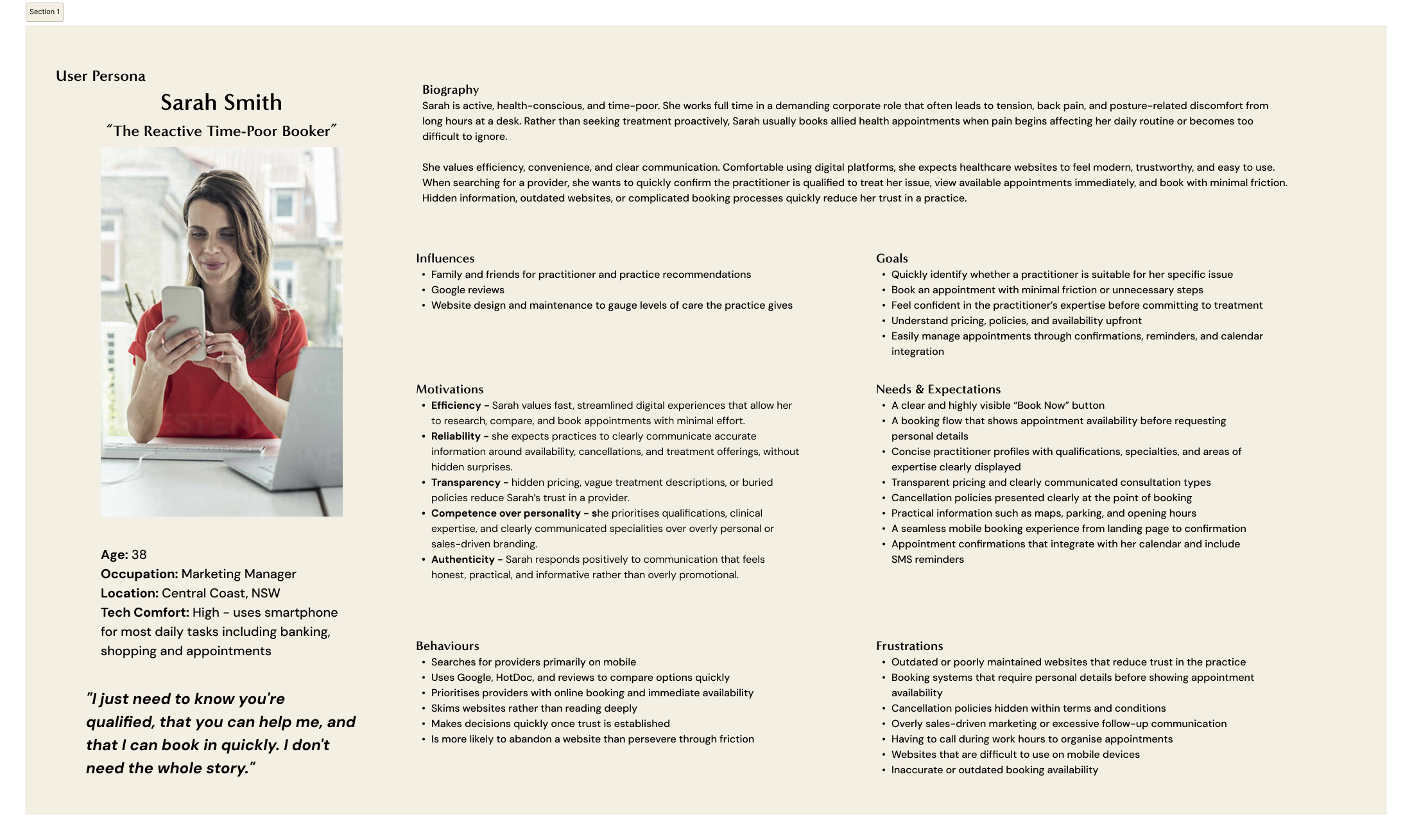
Using the research findings, I created the primary user persona “Sarah Smith, The Reactive, Time Poor Booker”.
Sarah is 38, a marketing manager on the Central Coast.
Active, health-conscious, and busy
Books allied health reactively, when something hurts too much to ignore
Needs to establish trust and book fast
Finds providers through recommendations, then validates them online
Always books on her phone
Skims information rather than reading everything
Will abandon a website rather than work through friction
With the research complete and the persona defined, the problem and “How Might We” statements became clear:
The Problem:
Time-poor patients often seek allied health care reactively and need to quickly determine whether a practitioner is trustworthy, relevant to their specific needs, and available to book.
However, many healthcare website fail to support these behaviours, creating frustration with websites that either have too much information or too little, and booking experiences that feel unnecessarily complicated or difficult to navigate.
How Might We Statements:
How Might We make finding, understanding, and booking an appointment feel effortless from anywhere on the site?
How Might We help patients quickly verify that a practitioner is qualified to treat their specific needs?
How Might We give patients just enough information to feel confident booking, without overwhelming them?

Ideation:
Navigation Structure:
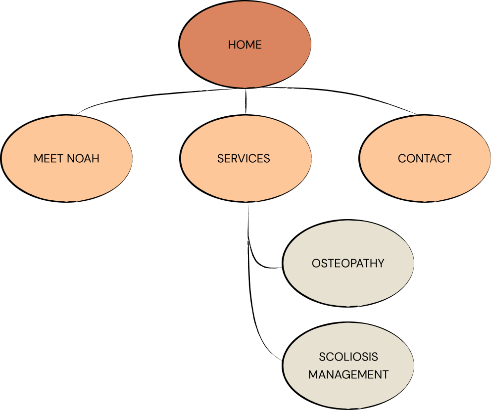
I worked through the navigation structure, keeping it deliberately simple.
Since Sarah skims rather than reads and makes decisions quickly, the site needed to deliver everything she needed to make a booking decision, without requiring her to hunt through multiple pages.
The hierarchy reflects this with:
a small number of primary items only
Osteopathy and Scoliosis Management as the only secondary items
Everything Sarah needs to make a booking decision is accessible on the landing page alone.
User Flow:
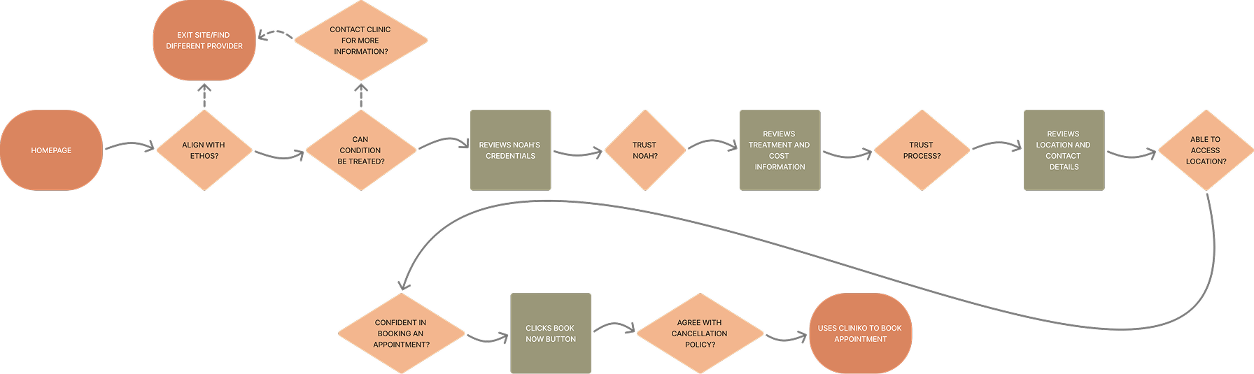
The primary user flow was designed around one goal, getting Sarah to a booking decision as quickly as possible.
The landing page does the heavy lifting, practice ethos, conditions treated, Noah's credentials and the treatment process are all visible without leaving the homepage
Location and contact details are visible in the footer on every page
The booking button is persistent across every page, ready to be pressed the moment Noah has earned Sarah's trust
The Design:
While sketching and wireframing, I worked in parallel to establish the visual direction for the site.
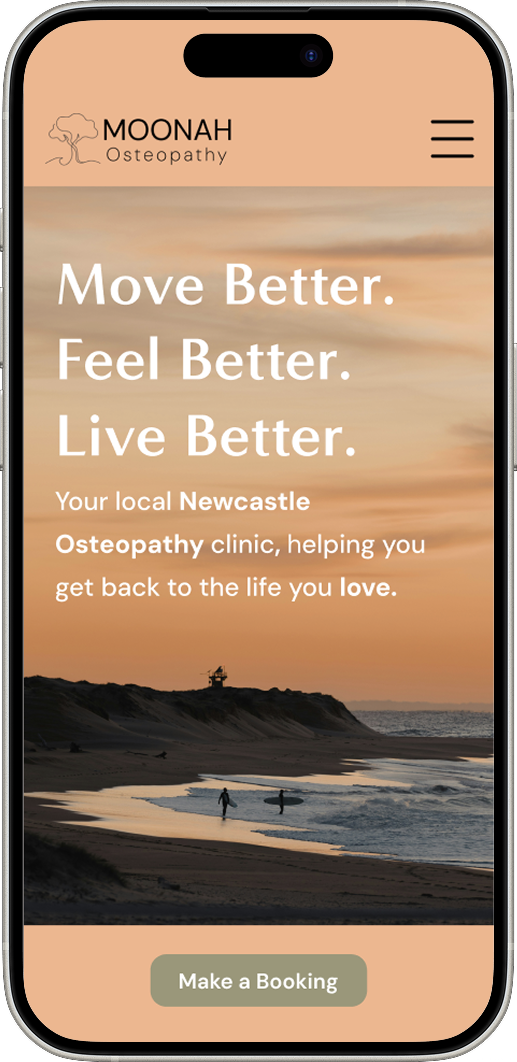
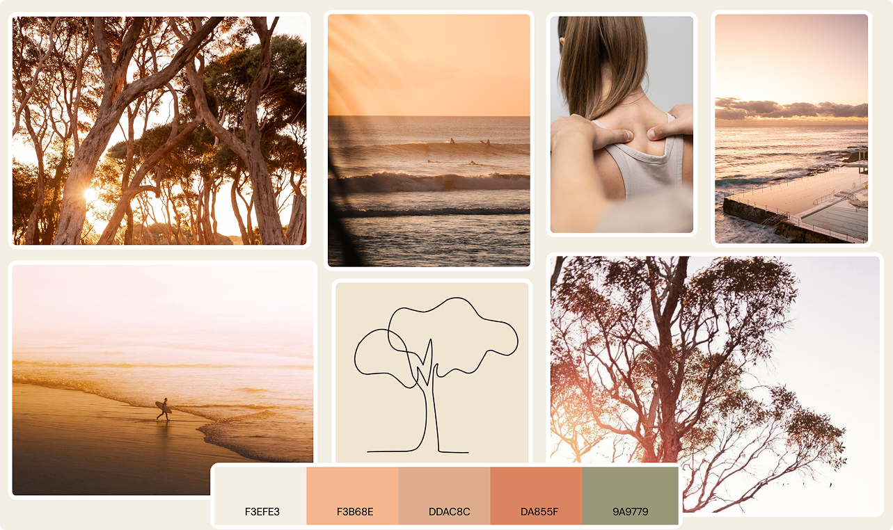
Drawing from Noah's brief of Earthy, Coastal, Subtle, I developed a mood board to set the visual direction before moving into high-fidelity design.
The colour palette landed on dusty Australian earth tones with a sage green accent referencing the Moonah tree.
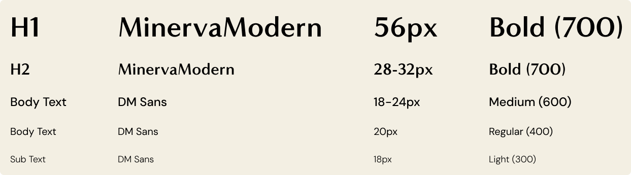
Font choices were established alongside the palette to ensure a cohesive visual language
Finalised brand assets were outside the scope of the project; I developed a placeholder logo for the prototype
A series of looks-like feels-like icons were also sourced

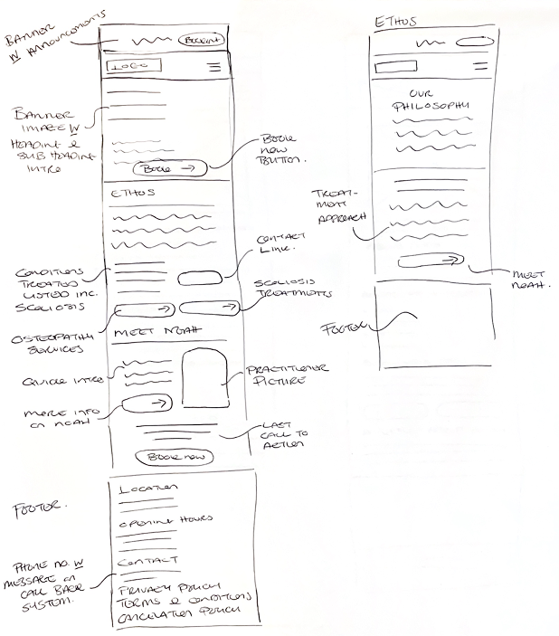
I adopted a mobile-first approach for the sketching and wireframing phase, based on user interviews showing that all respondents accessed allied health sites via mobile. This meant ensuring all information could be presented clearly on a smaller screen.
Sketches:
Wireframes:
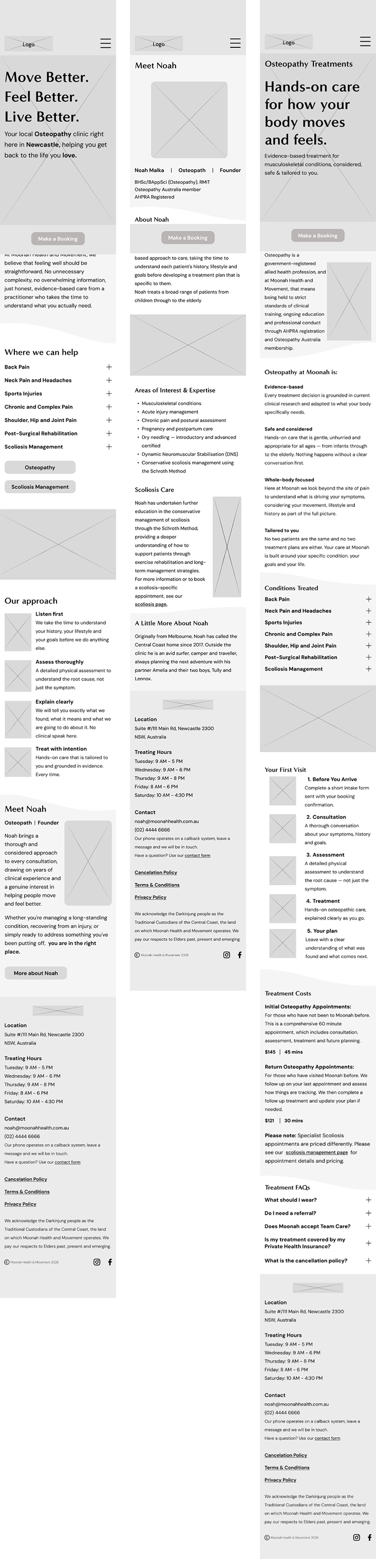
While wireframing, I continually referenced back to the research, evaluating every decision against the three HMW questions.
How Might We make finding, understanding, and booking an appointment feel effortless from anywhere on the site?
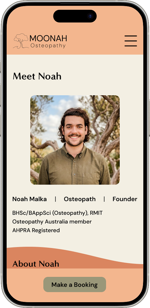
A persistent booking button incorporated throughout the site.

How Might We help patients quickly verify that a practitioner is qualified to treat their specific needs?
Noah's credentials broken into scannable sections rather than large paragraphs.

How Might We give patients just enough information to feel confident booking, without overwhelming them?
Accordion drop-down menus housing additional detail for patients who wanted to dig deeper.

Usability Testing:
I conducted usability testing with three participants, who each completed six tasks against the low-fidelity prototype.
Overall feedback was positive, all three navigated the site easily and without significant friction.
The key iterations identified were small but impactful:
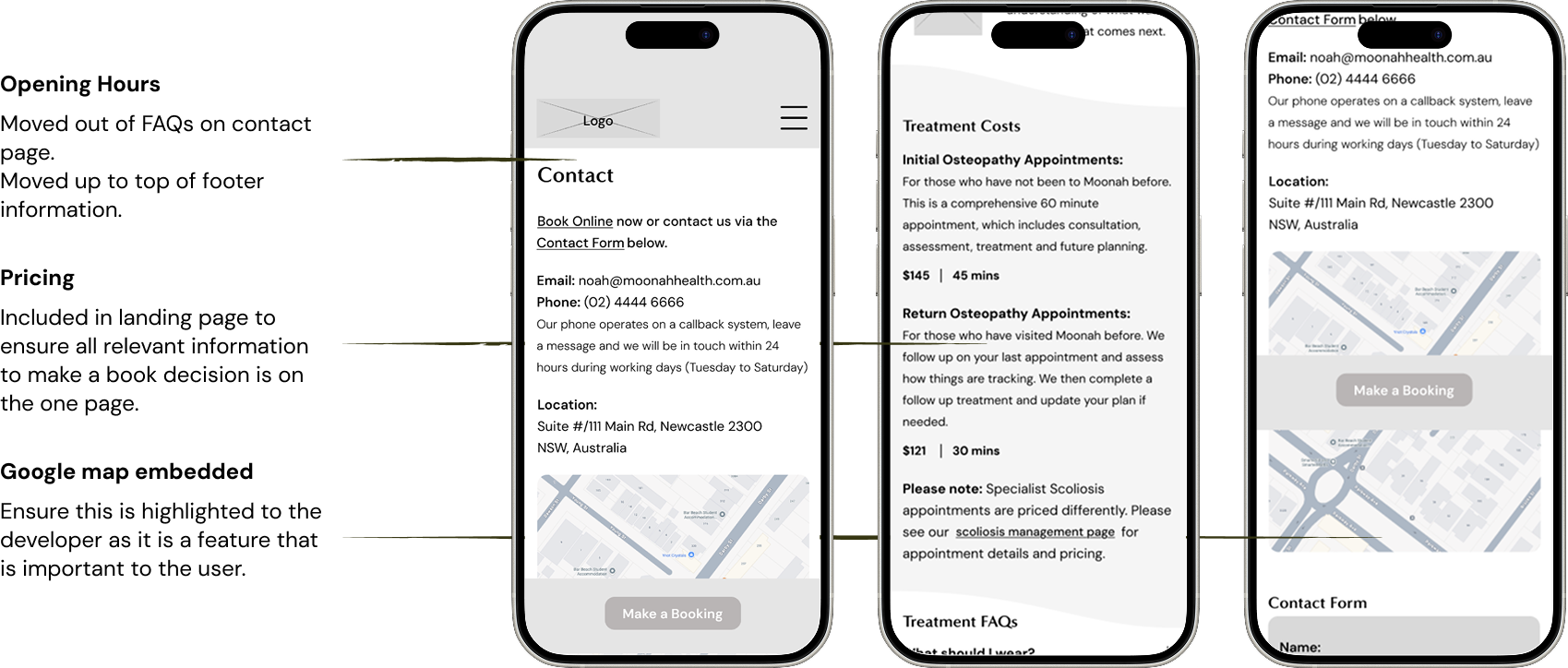
making opening hours more prominent throughout the site
adding a pricing summary to the homepage, so Sarah could gather everything she needed to book without leaving the landing page
ensuring the logo included the word “Osteopathy”
confirming the Google Map would be embed in the final build, an important feature for the user.
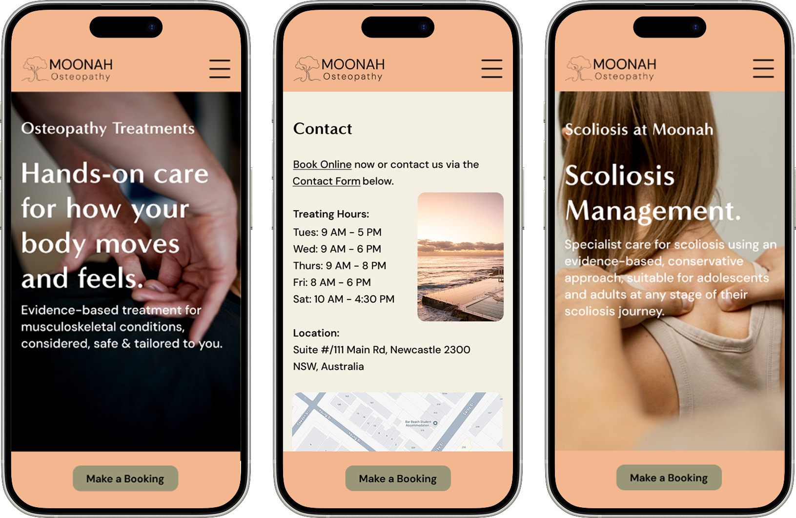
Once actioned the high-fidelity prototype was presented to Noah for final approval.
The Prototype:
The Wrap Up:
This project was about more than designing a website. It was about helping a thoughtful, skilled practitioner communicate who he is and what he offers, clearly, honestly, and without unnecessary noise.
Every decision throughout this project came back to one thing: making it as easy as possible for the right patient to find Noah, trust him, and book in. The research, the design, the compliance considerations, and the visual direction all served that single purpose.
Moonah Health and Movement has not launched yet, but I hope that when it does, its website reflects exactly what Noah set out to build, something warm, considered, and genuinely useful to the people it is designed for.